Today we managed to obtain feedback from our class colleagues on the second version of our digipak.
- No information on the DVD.
- Email address isn't needed.
- No upper case in the web address.
- The QR code needs to work, in order to show ICT skills. Linked to company blog.
- The sticker on the front cover was way too big.
- Huge line spacing can be seen on the sticker.
- Copyright information needs to be smaller.
- The main title on the front needs to be centred.
- Use plain Sariff font if needed.
 |
| Inner panel 1 |
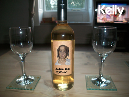
We decided to abandon the inner digipak design with the pictures of the wine bottles because my colleagues didn't understand the deeper meaning behind them.
 |
| Inner panel 2 |
 |
| Inner panel 3 |
.jpg) |
| Hidden credits panel |
 |
| Panel behind the front cover |
These next images are the panels which have been improved:
 |
| Front cover |
 |
| Back panel |
Now the QR code leads to the Blazing Grace production blog.
 |
| Spine |
Overall from this feedback while the outer panels are fine, the inside panels need changing. So now I will allow Sophie to make the inside of the digipak and I will take over making the magazine in order to speed things up in terms of scheduling.


.jpg)


No comments:
Post a Comment
No inappropriate comments, abuse of any form, spam, trolling etc.