Here is the final cut of our music video after months of long hard editing and reshoots/filming. Enjoy!
Thursday, 3 May 2012
ALL - Final Magazine Advert
Here is the final magazine advert. The only difference seen from my previous magazine advert post is that the font for Destiny's Child title seen at the top of the advert is different to what it was before after feedback from my colleagues.


Wednesday, 2 May 2012
ALL - Final Digipak
Today we finally managed to finish the digipak after creating each prototype and obtaining feedback via our colleagues and Media teacher.
Here is the front cover. At the top, you can see the band name in large font which is usually seen in the R&B genre. Then we have the smaller font for the sub-title which gives off a quirky feel because of what it says.
A bonus DVD sticker can also be seen on the front cover as well, advertising a DVD and it's extras. Lastly, the main front cover picture consists of the three performers walking through a suburban environment. This is similar to the back of the digipak which I'll talk about to later.
Next, we have the spine of the digipak (as seen above). The colouring used for the spine creates a binary opposition between light and dark. This is due to the white font in black space and black font in white space which are similar to the yin yang symbols, which link in with the theory that the band in the video symbolise fallen angels. The catalogue number and company logo are also present.
Here, we have the inside of the digipak. The inside is a two-panel spread which has a picture of the band lying on the floor in the form of three separate images merged into one. The colours of the pictures which make the two-panel spread symbolise the past, present and future. Black and white = silent film associated with the past, colour = present day and blue = hologram linking in with the future. The initials for the band can also be seen. While there are a lack of credits, there are digipaks out there which lack credits such as the Britney Spears Greatest Hits: My Prerogative.
Lastly, we have the back cover of the digipak which uses most of the conventions seen on digipak. These include, a track listing, list of bonus features, QR code, web addresses, a bar code, the company logo and copyright information. The picture used, links in with front cover because of change in shot type.
 |
| Front cover |
A bonus DVD sticker can also be seen on the front cover as well, advertising a DVD and it's extras. Lastly, the main front cover picture consists of the three performers walking through a suburban environment. This is similar to the back of the digipak which I'll talk about to later.
| Spine |
Next, we have the spine of the digipak (as seen above). The colouring used for the spine creates a binary opposition between light and dark. This is due to the white font in black space and black font in white space which are similar to the yin yang symbols, which link in with the theory that the band in the video symbolise fallen angels. The catalogue number and company logo are also present.
 |
| Inner panel |
 |
| Back of digipak |
AN - Evaluation Question 4
How did you use new media technologies in the construction
and research, planning and evaluation steps?
AN - Evaluation Question 2
How effective your combination of your main products and ancillary texts?
Tuesday, 1 May 2012
AN - Evaluation Question 1
In what ways does your media product use, develop or challenge forms and conventions of real media products?
Sunday, 29 April 2012
AN - Final Magazine Ad Development
 |
| This is an example a past student's work. |
- There was no point of the multi layering because he said to create a shadow-like effect, but it didn't work.
- The font was also weak, since it made the magazine advert look like that it was made in Publisher.
- He also mentioned that it looked like no research had been done, despite looking at a number of magazine adverts including some made by past students. Linking in with this, it's quite hard to find magazine adverts aimed at a female audience.
- www. should never be used in 2012.
- Unrealistic reviews.
- Weak layout.
- No price tag or Twitter/Facebook logos.
So putting this feedback into mind, created a new magazine ad. My teacher wanted me to put an image from the video in the area where the sky is, so I got a shot of the boyfriend and girlfriend walking down a path. I used the background eraser and quick selection brush tools to delete segments of the background of the picture.
Afterwards, I decreased the opacity and saturation quality so that it blends in with the poster. I also changed the tour dates by adding 2012 at the end of them and making the locations UK based. I also made the font pink so that it would appeal to a female target audience. Lastly a picture of the digipak's front cover can be seen as well so the public know what the product looks like.
 |
| FINAL Magazine Advert |
Thursday, 26 April 2012
AN - Audience Digipak Feedback
Today we managed to obtain feedback from our class colleagues on the second version of our digipak.
We decided to abandon the inner digipak design with the pictures of the wine bottles because my colleagues didn't understand the deeper meaning behind them.
These next images are the panels which have been improved:
- No information on the DVD.
- Email address isn't needed.
- No upper case in the web address.
- The QR code needs to work, in order to show ICT skills. Linked to company blog.
- The sticker on the front cover was way too big.
- Huge line spacing can be seen on the sticker.
- Copyright information needs to be smaller.
- The main title on the front needs to be centred.
- Use plain Sariff font if needed.
 |
| Inner panel 1 |
 |
| Inner panel 2 |
 |
| Inner panel 3 |
.jpg) |
| Hidden credits panel |
 |
| Panel behind the front cover |
These next images are the panels which have been improved:
 |
| Front cover |
 |
| Back panel |
Now the QR code leads to the Blazing Grace production blog.
| Spine |
Overall from this feedback while the outer panels are fine, the inside panels need changing. So now I will allow Sophie to make the inside of the digipak and I will take over making the magazine in order to speed things up in terms of scheduling.
Thursday, 19 April 2012
AN - Podcast 5: Audience feedback
In this podcast, I go solo by talking about the feedback from some friends of mine. I go into detail on topics such as long chunks of narrative and the use of Sepia.
Thursday, 22 March 2012
AN - Rough Cut 2 Feedback 22/3/12
Today in class, we managed to obtain some feedback on our second rough cut. Although a new cut is in the works, this feedback was still useful. Here is what our colleagues said:
- Performers need to vocalise.
- Sepia is good.
- Generate a still image at the beginning.
- Cross faded
- More performance sequences needed.
- More dance moves need to be seen.
- Shaky shots in some places
- Cut down on the amount of narrative.
- More slow-motion needs to be used in certain places.
- Get a fixed shot of the rose.
- Edit the video so it fits in with the beat and pacing of the track.
- More variation in footage.
- Split screen technique needs to be used.
- Clumsy use of media language. e.g. shot of member's leg.
- Layer clips
- Cut to beat at points
- Aspect ratio needs changing.
- Change the band member's positioning around at points in the video.
Saturday, 17 March 2012
ALL - Penultimate Cut
Here is our penultimate cut for the coursework, it is a complete video for the song. However, we will have to refilm 2 or 3 shots and get footage of the boyfriend's aftermath for the climax of the video, since we plan to implement a split screen effect.
Thursday, 15 March 2012
ALL - "Final" Magazine Ad
After many delays and issues, we finally managed to finish the magazine advert thanks to Miss Sophie Dixon, with some Photoshop advice from me of course. Anyway deconstructing the advert, it is made up of four pictures of the band. The band's clothing denotes the male gaze theory where the audience is shown that women are treated nothing more than seductive objects for male desire.
Pink text is used at the top left hand corner of the advert, to attract a female audience towards the digipak since it is the prime colour associated with women. Twitter and Facebook links to the company/band pages can be seen at the bottom left hand corner of the page. This is a common convention seen across different media products from music videos to even video games.
As for what the advert is advertising, it is promoting the upcoming release of the digipak as shown by the release date in silver. Little text is shown to give the advert a mysterious feel with the only piece of information being a date of 15th March.

 |
| Here is an example shown to promote the 360/PS3 title, Ninja Gaiden 3 which comes out next week. Yey! |
As for what the advert is advertising, it is promoting the upcoming release of the digipak as shown by the release date in silver. Little text is shown to give the advert a mysterious feel with the only piece of information being a date of 15th March.

Wednesday, 14 March 2012
AN - "Final" Digipak
Here is the final version of my digipak. As shown below, there are 3 main panels which can be folded out.
- On the front cover we have a ripped picture of the band which links in with the break up theme of the video
- Then on the inside we have three panels of the band member's faces shown on a bottle of wine with two glasses. On the first panel they're empty, second they're full and third, one glass has a tiny bit of wine next and the other glass is smashed.
- When you fold out the first panel, a "saucy" picture of the band is seen. This links in with the male gaze theory because of the artists' clothing. Leading to male target audience.
- If you fold the middle inside panel, the credits of the digipak can be seen. Which includes, the roles of the group and links to the company's Twitter and Facebook pages
- The discs come out of two disc sleeves which are part of the two panels on the sides of the middle one.
- Lastly on the back of the digipak we have the track and extras listing. Besides that, we also have a link to the main website, bar and QR codes along with a picture of band members walking away.

Tuesday, 13 March 2012
AN - Update 13/03/12
With the penultimate deadline coming up this Friday, here are a list of tasks that our group is currently doing to prepare for that deadline.
- Film the aftermath of the girlfriend (final piece of filming) - ALL
- Make the digipaks - ALL
- Make the magazine adverts - SD and KM
- Evaluation post - ALL
- Evaluation podcasts - ALL (separately)
Tuesday, 6 March 2012
AN - Filming 6/3/12
Today we filmed our penultimate bit of footage during our Rec & Leisure time. In this session, mostly filmed stuff which was based on the feedback we obtained from the previous Rough Cut. This feedback included ongoing continuity errors which had the boyfriend (James) making a dinner for the girlfriend (Katie) at her house, this made no sense to people and because of this, we had to film it that the house belonged to the boyfriend with the girlfriend walking up to the house and walking out to signify the break up has taken place. We used a variety of shots while filming this sequence such a high angle shot of the break up and a low angle shot of the girlfriend's feet walking up to the house.
Besides that we also filmed a close up of the beans on bread for the dinner scene, since people did not understand what was happening during that sequence so by adding shot variety we will give our audience a better idea of what was happening in the situation.
Besides that we also filmed a close up of the beans on bread for the dinner scene, since people did not understand what was happening during that sequence so by adding shot variety we will give our audience a better idea of what was happening in the situation.
SD - Digipak Example 3: Girl's Aloud The Show
I was surprised how plain the CD design for the Girls Aloud single 'The Show' was. The CD is all black and white (something Asa has been wanting to do our digipak like) there is only one image of a directors cutting device on it which is also in black and white. This is a countertype of what you would expect as the girls a bunch of singers not actresses although this obviously is linked to the name of the album and track one on the track listing, which only contains two songs 'The Show' and the later released single 'Jump' although this is a remix of the original track. The track listing is shown on the cut thing as-well as the date the single was released underneath. In a box next to the image, there is another box containing small font explaining again the full rights go to the distributor and record label which is again, Polydor the same label Hear'say were signed to owned by Universal Music Company. Below this there are four logos; one with an image and then the name GirlsAloud, another saying Aloudsound which is researched and found that it is the name of the official Girls Aloud fan site, Compact disc digital audio (which has been featured on all of my examples), and the last the letters GA inside a triangle which looks like the one which usually contains film age ratings.

This is the front cover of the single 'The Show' it is quite plane for a Girl band's cover but as the band has recently been put together before this, it names the members and is quite 'cutesy' which matches with the idea of putting a fan site in the bottom right corner in the hope that the band would become bigger and more well known. The 'GA' in the traingle sticks with this idea and is quite fun rating themselves as just the band quite a simple idea, the green obviously means suitable for anyone which may imply that the band are trying to appeal to all audiences and arn't marketing themselves specifically or to one core audience although obviously they don't appeal to all audiences.

This is the front cover of the single 'The Show' it is quite plane for a Girl band's cover but as the band has recently been put together before this, it names the members and is quite 'cutesy' which matches with the idea of putting a fan site in the bottom right corner in the hope that the band would become bigger and more well known. The 'GA' in the traingle sticks with this idea and is quite fun rating themselves as just the band quite a simple idea, the green obviously means suitable for anyone which may imply that the band are trying to appeal to all audiences and arn't marketing themselves specifically or to one core audience although obviously they don't appeal to all audiences.
SD - CD Disc Design: Example Two
 I have been looking at the Cd design of the single 'To you I belong' - Bewitched, the design gives off a fantasy genre which may attract audiences interested in fantasy films. The Cd is goldwith silver mirrored stars on the disc, there is small font which goes around the curcumfrance of the cd which explains that all rights are to the producers and record company and that it should not be copied illegally, this is a convention of Cd design as the regularly have mention of these rights of the distributor. The logo reading 'compact disc digital audio' is also on this Cd found on example One. There is a three track list found (like the same as example one) below the centre of the disc, this text is in silver and purple, track times are alos found here next to the song title. Epic records logo is found aswell as the CD number and a weird symbol/logo which probably stands for another record label. The name of the band is at the top of the Cd and the 'e' in Bewitched has been replaced with a gold star, below this is the name of the single 'To You I Belong' which is also the name of track 1.
SD - CD Disc Design: Example One
I have looked at a range of example of how we can design our disc to go into the digipaks, as we're having two (one for the music video we're currently producing and the other featuring other tracks by Desiny's Child) we're going to have more to think about although thetwo discs will be similar in design they will obviously have different description and information shown on the front. Hear'says single Everybody is a white disc with the letters 'R'S' in a bold blue font outlined in darker blue underneath this says Hear'say and lists four featured tracks on the CD, there is then in a very small font information on copyright and Universal Music Company below this there are two logos one Polydor (Polydor is a record company which is owned by Universal Music Group) our will instead feature Columbia Records logo as this is the record label that Destiny's Child were most recently signed to before they split. The other reading compact disc digital audio a feature that has been found on all the examples I've looked at and therefore will be featured on our disc one and two.
 This shot of the band inspired a number of shots that me and Katie took during filming. The way in which we used it was to rotate the camera round to each member as their chorus in the song came up which were given to each of them to lip sync before filming.

AN/SD - Target Audience

The age of the couple is similar to the age of the audience. As a result the audience will be able to relate to the characters.
The genre is another reason for our choice of target audience. R&B tends to be aimed at a similar target audience to the video's. Also, the video could possibly appeal to a male demographic because of the variety of the genre. However it seems the audience is made up of more women and men.
This means that, the video will mostly aim at a 16 to 24 female target audience who is currently in a relationship or has been in one.
Here are some additional points on target audience:
- General fans of the band and the R&B genre.
- The male gaze aspect would bring in a secondary male audience.
- Our audience may be interested in viewing romantic comedy films rather than indie and horror films.
- They will be interested in mainstream music and genre's such as R&B, Pop and maybe Hip-hop.
- The audience may also read gossip magazine rather than informative newsletters and papers, these may include the ones that target the same age group ie. More, Now & Look
- The uses of gratifications theory is good to use when thinking about the audience you are trying to target, getting a fuller view of what the viewer is interested in will help when making decissions to include within the text itself, magazine advertisment and digipak.
- Destiny's Childs audience is Mainstream but also a Mass audience although because they are a female band in the R&B genre which could be seen as attracting a niche audience.
'Uses of gratifications theory is an approach to understanding why people actively seek out specific media outlets and content for gratification purposes. The theory discusses how users proactively search for media that will not only meet a given need but enhance knowledge, social interactions and diversion.
This theory assumes that members of the audience are not passive but take an active role in interpreting and integrating media into their own lives. The theory also holds that audiences are responsible for choosing media to meet their needs. The approach suggests that people use the media to fulfill specific gratifications. This theory would then imply that the media compete against other information sources for viewers' gratification.'
Thursday, 1 March 2012
SD - Beyonce Magazine Ad
We have really struggled to find Destiny's Child magazine advertisements Katie is the only one that has managed to find an actual one found in Rolling Stone magazine. The other ones we've found have been fragrance advertisements released by Beyonce which are much more common. From looking at the ad's we've been able to denote there is often a lot of the colour red used in lips which we already knew is a common convention found in girl band music videos to include the male gaze theory.
The magazine advertisement I have found is a L'oreal lipstick shade (red)

KM/AN - Product Creating Schedule
On Tuesday we filmed a new scene, this was just another scene showing the boyfriend and girlfriend together before the aftermath's take place.
We now need to film the girlfriend's aftermath and re shoot the scene when the meal takes place for the girlfriend and boyfriend because their was a bit of a mix up with the scene itself, so a quick re shoot should fix the problem.
So far with the Digipak and Magazine Ad, we have not spent enough time as we would of hoped but all three of us have either made a prototype or researched on previous Digipaks and Magazine Ad's.
We will have an update soon, and will hopefully have a final rough cut to post up early next week.
Here is our plan to deal with these products and what we have to do.
Filming:
Girlfriend's aftermath
Girlfriend walking up to the house
Girlfriend leaving house
Close up of beans on toast
We plan on filming this stuff this weekend and edit the items on Monday.
Digipak:
Implement feedback into Asa's digipak
Sophie and Katie need to learn how to use Photoshop. If they run out of time, Asa's digipak will be the main one.
Magazine Ad:
Research done.
Sophie and Katie will use either Photoshop or Microsoft Publisher to create the advert.
A photoshoot of the band will also take place so that pictures can be obtained for the digipaks. More information coming soon.
Tuesday, 28 February 2012
KM - New scene filmed!
Myself, Asa , Sophie & our actor James Newton have filmed today. Our location was Ilkley Park, all we did was film another scene for the boyfriend and girlfriend, this will be shown also as a flashback in our video just before the break-up, this as well as the rest of our 'flashback' shots will be shown to the audience in Sepia.
To add both tension, or scenery shots, we filmed a small variety of shots, including ducks, to do so we threw bread at them, once we had a group of them I threw some bread into the river, causing them to splash and make a fuss, we will use this shot when a key change int he song occurs, or it can also signify the tension between the couple. It's only a simple shot but it adds to the shot variation.
 |
| Behold ducks! |
Thursday, 23 February 2012
SD - Editing decisions within the first minute of the music video
Throughout the first minute of footage for the music video there have obviously been decissions that we have made. We decided to use a shot of Mel that is a straight forward medium shot from the front we wern't origionally going to include this shot but due to the bright light shining down on her we thought it looked high end and glamourous a key convention in pop and mainstream chart music in general so we have now included it.
There is also a section of the video in which Katie and James the girlfriend and boyfriend are sitting at the dinner table talking and laughing we origionally thought that this clip was too long and because marks are awarded fr shot variation we should cut it down or split it and have a section of performance inbetween although Asa's argument that the clip should be included in full because it flows well and shows the couple looking natural and creates a sense of realism which we agreed was a fair point. Many other decissions were made as we have loads of footage that we could of used although as it is is simply a rough cut we have time to change smaller decissions in the video later. We have now handed in RoughCut1 which is a minute long to Dave and he is going to play it to the class tomorrow so we can get some feedback.
There is also a section of the video in which Katie and James the girlfriend and boyfriend are sitting at the dinner table talking and laughing we origionally thought that this clip was too long and because marks are awarded fr shot variation we should cut it down or split it and have a section of performance inbetween although Asa's argument that the clip should be included in full because it flows well and shows the couple looking natural and creates a sense of realism which we agreed was a fair point. Many other decissions were made as we have loads of footage that we could of used although as it is is simply a rough cut we have time to change smaller decissions in the video later. We have now handed in RoughCut1 which is a minute long to Dave and he is going to play it to the class tomorrow so we can get some feedback.
AN - It's over 100! Blog Post 100: Rough Cut
To celebrate my 100th blog post, here is a short rough cut of our music video which shows what we plan to do with the narrative and performance parts of the video.
Although this is only a rough cut, it isn't a full one. For what we have left to add/film we need at least two more date scenes, more shot variety during the final date and the break up, and the aftermath of both main characters.
In terms of tools, we used the Sepia tool in order to make the video black and white. This was done in order to signify a flashback. The rough cut is basically the intro of the video with a primary focus on performance and narrative. Varying between the two.
Wednesday, 22 February 2012
KM - Possible Magazine Ideas Continued...

Giving the reader the information they will need when accessing the website and what there is to offer for anyone who would like to become apart of the fan site.
The picture is striking, and is the first thing you see when looking at the advert. The colour scheme is a lot different to Beyonce's perfume advert, but this shows me as well as the reader how different you have to make a advert for a solo act in comparison to a girl group.
This advert has definitely helped with ideas for our own advert, helping us see where we can place the picture, how big it should be in comparison to the information given, and how much information you should give.
Here we have a magazine advert which can give us
ideas for specific colour schemes or poses the band
members can use.

KM - Possible Magazine Ideas

Although this Beyonce advert is not for her album, or Destinys Child's magazine advert it is infact advertising her perfume range.
The pose, is a very powerful strong status that her fans know is a typical famous and well known fact of Beyonce and the image she often gives off. The clothing is revealing and therefore does apply to the male gaze, although I don't really want to use this for my magazine as I believe you can still get a male audience behind you without the use of the male gaze. With Beyonce looking straight at you it gives a almost personal, intimidating feel towards you, however in a good way, as in you will feel more strong, confident and powerful if you wear her perfume brand.
Her clothing is in relation to the page layout in general, with the 'laser' looking light beams crossing the page, the clothing is also quite sharpe and bright. In particular i notice this witih the common theme of the warrior look from the clothing and light beams relate.
The colour scheme all round is blue, i love this effect as it works well with the perfume bottle being blue, and myself and Sophie have both agreed on the colour scheme for our digipak to be blue . The different contrasts work well by also standing the page out by using the colour blue and the diferent lighting is eye catching.
The very little text on the page gets the the point for the viewers as when flicking through a magazine they dont want to have to read paragraphs on end ust too find out the name of the product, what the product is, and what brand it is. All of these factors are stated clearly in white text to stand out even more, as well as the larger font.
ALL - Blazing Grace Update Vodcast
Here is an update on what is happening with the products we are making. The digipak, magazine ad and the music video itself.
Untitled from Katie Mallows on Vimeo.
Untitled from Katie Mallows on Vimeo.
ALL - Behind the Scenes Vodcast 16/02
Here is the behind the scenes vodcast about filming at Katie's house and our plans for the future.
Monday, 20 February 2012
SD - Digipak Layout
As we have decided to make two prototype digipaks, Asa making one and me the other my prototype is nearly finished with just the glitter to add on top of the text. I have already made one digipak although i didnt use a stencil when using the glitter pens which just ruined the effect and it looked messy and unprofessional so ill buy some stencils tomorrow and finished post with pictures of the digipak will be uploaded tomorrow. I went for quite a simple design like mine and katies plan pictures with pale blue paperboard Destiny's Child in large glitter font at the top of the cover and a photo of the band below, the back of the digipak features a photo of destinys child from behind although id like to change this to a picture of our cast of Destinys child taken from behind them holding hand and walking into the distance.
Inside the pigipak features the words associated with relationships and love in the centre which will be in black and white like newspaper text and then the two cd cases will be either side the left one featuring the songs by Destiny's child which arnt upbeat but slower and the right side cd contains our music video. Track listing will be shown on the left face when looking at the digipak from the back
Inside the pigipak features the words associated with relationships and love in the centre which will be in black and white like newspaper text and then the two cd cases will be either side the left one featuring the songs by Destiny's child which arnt upbeat but slower and the right side cd contains our music video. Track listing will be shown on the left face when looking at the digipak from the back
Thursday, 16 February 2012
AN - Shooting 16/02/12

We used a variety of shots to during filming. These included, high angle, low angle, over the shoulder long, mid and shot-reverse shots. By doing this, we are able to show a variety of shots with our video so that we aren't lacking.
 As you can see here in this image, this is our attempt at the broken frame (it's the a cheap one from Boyes so don't ask about the lack of an actual frame).
Thursday, 9 February 2012
SD - Digipak Materials
Most digipaks are made from paper board or card and contain either a plastic or card CD/DVD trays internally. Previous digipaks that have been released by the band include ones with titles which include 'Number1's' 'Best of Destiny's Child' 'Soul divas' and 'Bye Survivor' Our digipak will be named 'Emotions' which will contain the track and music video on one CD and on the other their will be other down beat releases that they have produced.
The Digipak 'Survivor' is a Carbon neutral edition (which means that it has a net zero carbon footprint which refers to achieving net zero carbon emissions by balancing a measured amount of carbon released with an equivalent amount sequestered or offset, or buying enough carbon credits to make up the difference) making the digipak 'green'
Our digipak will be made of pale blue paperboard and silver and gold glitter will be used for the Track listing on the back of the digipak and for the Name of the digipak 'Emotions' aswell as Destiny's Child or DC in italic swirly font.
Wednesday, 8 February 2012
SD - My new Narrative idea - change in story line.
Although we have shot the performance aspect of the music video, we still have concerns about the narrative aspect. Our original idea were going to be one or two 'dates' in which the actors Francesca and James would act like a stereotypical couple in a good relationship. We were the going to have the chorus of our chose track Emotion followed by another narrative aspect of the couple arguing the reason for this argument was going to be because James the boyfriend) had been cheating on Francesca with a waitress at the restaurant he had previously taken her to resulting in the couple breaking up.
The new idea is going to involve instead of a third actor (the girl that worked at the restaurant that James cheated on Francesca with) we're going to do a date scene in which James will have to leave suddenly and will leave his phone at Francesca and she reads his messages and finds flirty messages from other girls, this will cause her to smash the photo of the couple which will be shot as a close up on the floor. She will then call James' house phone later on and arrange to meet the following day to return the mobile at a restaurant where the final argument and break-up will take place.
The new idea is going to involve instead of a third actor (the girl that worked at the restaurant that James cheated on Francesca with) we're going to do a date scene in which James will have to leave suddenly and will leave his phone at Francesca and she reads his messages and finds flirty messages from other girls, this will cause her to smash the photo of the couple which will be shot as a close up on the floor. She will then call James' house phone later on and arrange to meet the following day to return the mobile at a restaurant where the final argument and break-up will take place.
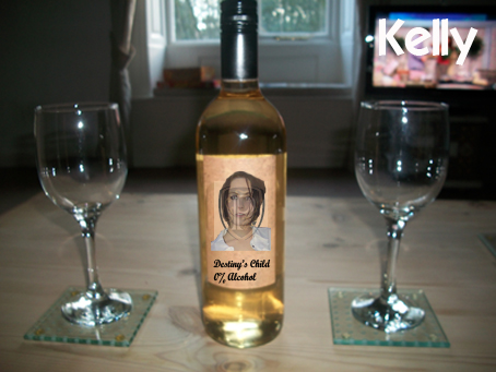
AN - Digipak Feedback
Today I got feedback for my prototype digipak and although, the physical look was praised (i.e. the product being a 6-panel fold out with disc sleeves I got quite a bit feedback concerning the look of it.
- Use more ICT skills. i.e. layering
- The two inside middle panels have a long shot of the band members.
- Smaller text
- Represent emotions in the digipak.
- Across the three inside panels, we have three different shots of a champagne bottle with a picture of Michelle on the bottle.
- Next we have the bottle with a picture of Beyonce's face along with two filled up wine glasses.
- In the last shot, the bottle has Kelly's face on it and the bottle is empty with an empty glass and a broken one.
- Background is too dull.
- Feet on the panel behind the main one.
Here is the digipak prototype:
 |
| Front cover |
 |
| Inner panels |
 |
| Hidden credits panel (unfinished) |
 |
| Back cover |
KM - Editing Tip!
Just a quick post to say that today whilst editing I have found out that if you click on the Motion button in the viewer section of final cut you can rotate a clip, or if you look at the scale section you can even zoom in to your clips!
Tuesday, 7 February 2012
AN - Altered Video Idea
Today I spoke with my Media teacher concerning problems with filming and he suggested that due to problems getting actors, our group needs to alter the idea a bit. Here's a list of points he made concerning this:
- Use the Year 10 cafe area to film the restaurant scene and use props such as cutlery, plates and food etc.
- Have romantic conventions such as guy pouring drinks for each other and pulling a chair out for the girlfriend to sit on.
- Have a total of 3 or 4 dates with the last date being the argument.
- Cross cut shots during the argument to show conversation between couple.
- Have one of the dates be a picnic, possibly to add humour due to the snow.
- Have the boyfriend blindfold the girl and take her to the restaurant.
- Linking in with the picnic point, denote the couple as ignoring all of the negative annoyances in life.
- The couple meet each other by accidently bumping into each other, dropping their phones and end taking the wrong phone. (Have to be the same make/brand)
- One of the dates could be at the riverside with the couple feeding some ducks.
- Could use some extras for the restaurant scene to make the place seem more lively and add to the realism.
- Have a scene where the couple are cooking and being playful at the same time.
- I need to use the codes and conventions of rom-coms to make this idea work.
Looking through this list of ideas, I will implement most of them into the video and maybe abandon the idea of a third actor.
Monday, 6 February 2012
SD & KM - Behind the scenes of filming performance (costume choices)
In this vodcast we discuss the choices we made regarding clothing, although it does not include the second costume choices we decided to include later on. The three actresses changed from the white dresses shown above to deeper reds and purple dresses which signify sex, love and passion a countertype of white that is plain and shows little emotion. The actresses come together at the end and become stronger like a unity shown by the colour change to powerful rather then the white, fading into the background.
Monday, 30 January 2012
SD & KM Vodcast 1 - Filming the performance aspect
Here is a vodcast, talking about filming the performance aspect of the video.
Untitled from sophie dixon on Vimeo.
Untitled from sophie dixon on Vimeo.
Sunday, 29 January 2012
SD - Filming Update
We will be now filming the performance aspect of the music video tomorrow with mel and annie and hope to get two cameras so we can have greater shot variation and more choices when it comes down to editing throughout the week we also plan to upload the footage we have already got and editing up on the blog so we can get feedback on work we've completed so far.
Monday, 23 January 2012
SD - Meet Destiny's Child
 |
| Annie |
 |
| Mel |
Annie Cutillo will also play one of the band members and has also done alot of dance such as poledancing so she will be able to 'throw some shapes' haha when filming tomorrow. She will also be wearing and white dress but with black heels. Annie will play Kelly Rowland.
Sophie Dixon Unfortunatly since our other actress has too much work on with exams at the moment I have had to take on the rold of Michelle Williams during filming tomorrow although judging by the majority of Destiny's Child video she takes more of a back seat than the other two Beyonce in particular which is why I thought i should be her and I have alot less dancing experiance tan the other two so ill just have to do my best.
 |
| Sophie |
Friday, 13 January 2012
AN - Digipak Concepts
Here is my idea for what the group's digipak should look like, with pictures and annotations to show it.


Wednesday, 11 January 2012
AN - Digipak Example 1: Britney Spears Greatest Hits

- Instead of being a stereotypical fold out digipak, which usually has 4+ panels. This is simply a 2 panel disc sleeve.
- Picture of Britney Spears on the front wearing a fur jacket, bra and shorts.
- Clothing suggests sexual content because the digipak comes with two discs. (Second disc might have explicit music videos?)
- For example, for most of the My Prerogative video, Britney is mostly seen in her underwear and in the video for Do Somethin' (last track on the disc), she can be seen wearing similar clothing to that on the cover, except that the jacket is white and instead of shorts, she is seen in her "panties"

- A light blue greyish colour is used for cover of the digipak along with the white border.
- This is done in order to make Britney stand out with her black clothing and tanned, shiny skin. This links in with the male gaze theory.
- On the back of the digipak, we have the track listing.
- Below the listing, we have some very brief credits along with three web addresses and copyright information at the bottom.
- Then at the bottom right hand corner, we have the barcode and the company logos above it.

Tuesday, 10 January 2012
KM - What Influenced my Ideas

Then came along other girl bands such as The Saturdays, Girls Aloud, & the Sugababes. All very well known and because of this the were automatically a role model for young girls.
Watching their music videos over the years I have noticed things that the "typical" girl band will include sexy outfits, lots of make up, usually they will dance, and good looking boys are used in the videos.
My influence for Destinys Child song, Emotion was from all these videos. Seeing the matching outfits, glitz and glamour. This is how I imagined my video to be.

The common shot types used in girl band video's and usually a close up on specific body parts like, legs, chest, lips and eyes. Also a group shot is used to show the whole band together, this varies the shot types in the video.
Also, as part of our research building up to our final idea, we looked at last years A2 groups and the music videos they had made to see what was good to include.
I looked at Emmie & Megan's music video which was Backstreet Boys, "As long as you love me", for one of their locations used in the video was the Ilkley Moor, which is now being used in our music video.
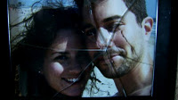
Another influence for a specific shot to start our music video was from the film 'Paranormal Activity' (2009, Oren Peli) this is used because there is a part of the film were the picture of the couple together is smashed on the boyfriends face, signifying bad luck to him, or something bad is going to happen to him, which in our case is that he cheats on his girlfriend.
 This shot will be used at the beginning zooming in and then coming to life, this is when the video will start.
 Black and white will be included in the video as a flashback. This will be shown in the video when the aftermath of the breakup is taking place on both behalves of the boyfriend and girlfriend. This is also being used in the previous A2 video I watched.
Asa recently looked at The Book of Enoch. "Fallen Angels", play a massive role in this book, and this is what has influenced us to look more in depth at the costume the band members will possible wear. Sophie has suggested black, so we are not 100% which direction we are going to take just yet, but looking at a varieties of options helps us figure out what we can imagine the band members to look like. This picture could possibly help us figure out which route to take, Minus the Wings!!
Subscribe to:
Posts (Atom)